About Selah House
Selah House is a Christian-based eating disorder recovery center for women and young girls. Their homelike setting, expert care, and excellent clinician to patient ratio are all differentiators in their market and a major draw for families seeking a more comfortable environment for their loved ones during their time of recovery.
The Challenge
Selah’s website was out of date and not representative of their identity as a business or of the journey patient’s would experience while there. Their treatment center attracts people both nationally and internationally, so a strong online presence is crucial for them to be able to compete and exceed peers in their market.
The Solution
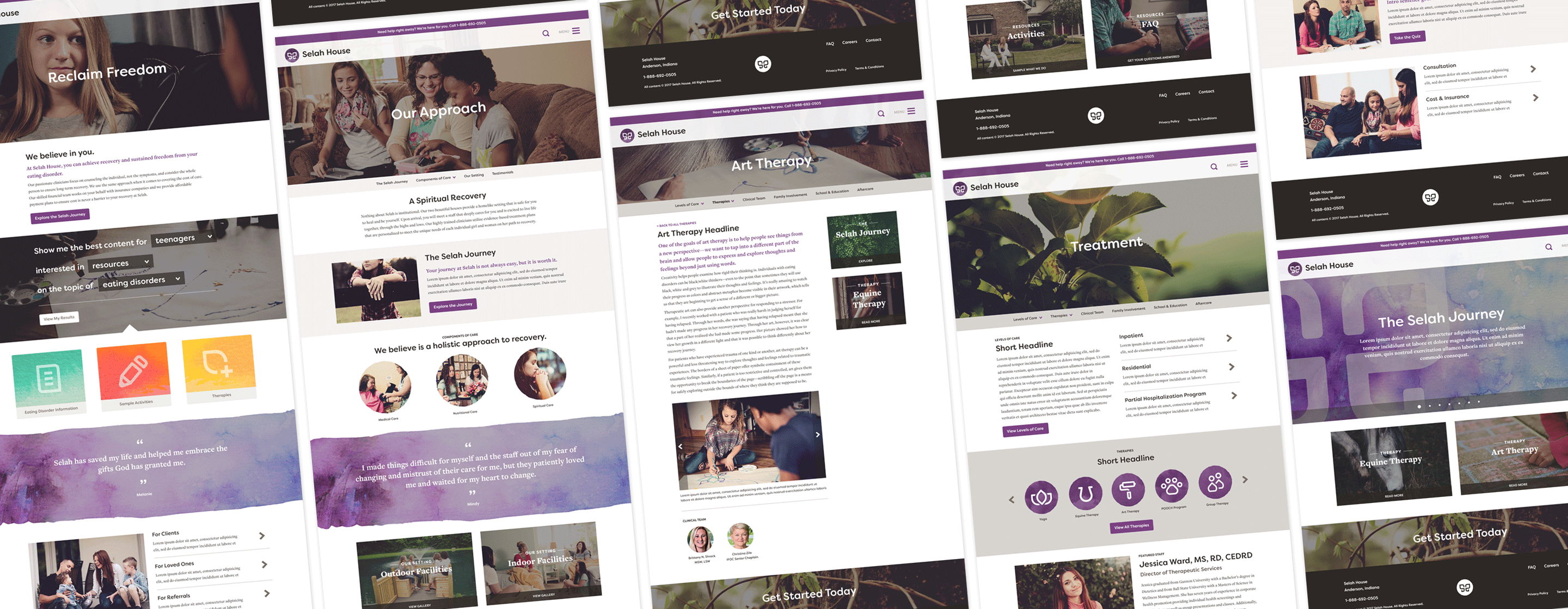
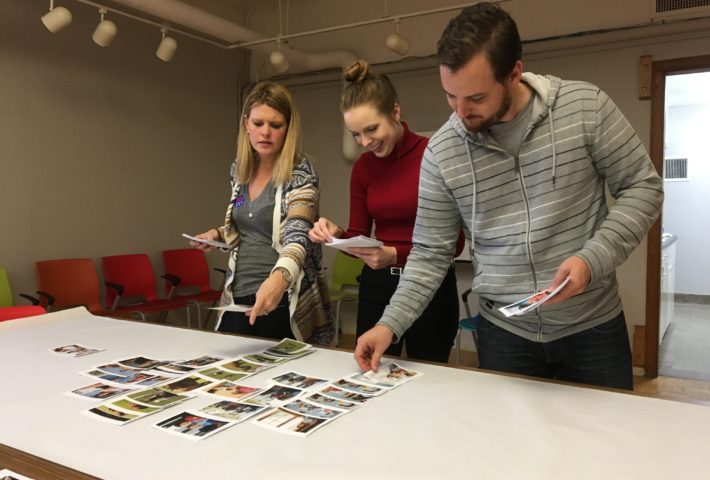
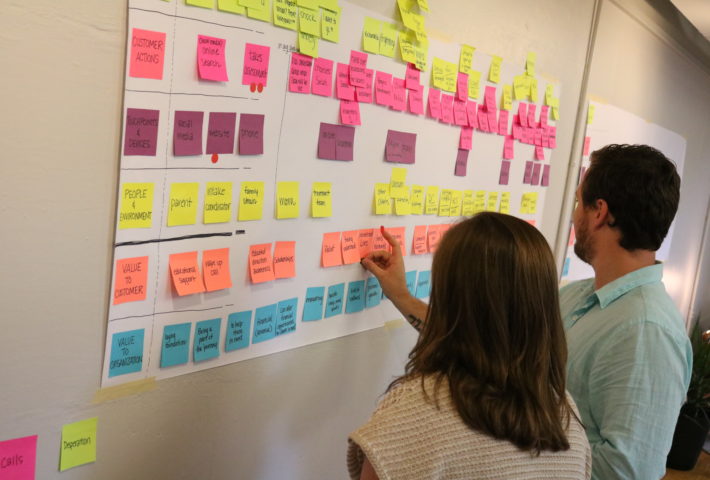
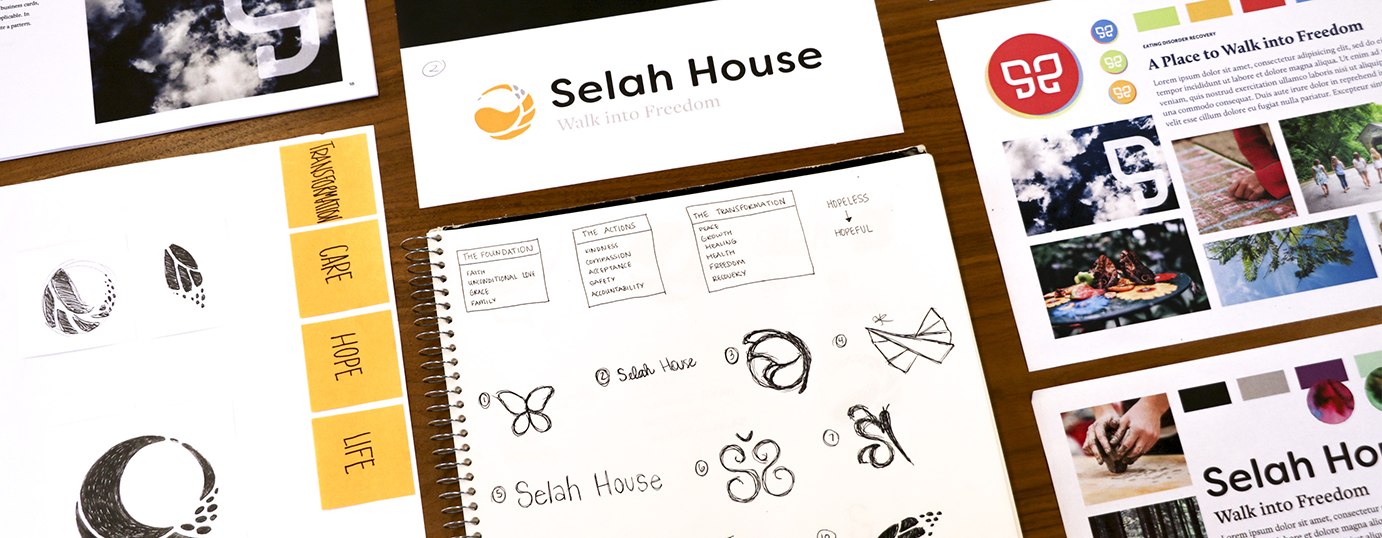
Through our design research, which included interviewing Selah’s past clients and families of past clients, it became evident early on that people did not care for the logo, wanted more photography, and needed clearer information available to them. In addition to a new website, we explored logo concepts, defined brand traits to guide a new visual aesthetic and messaging, and outlined a clear content architecture based upon industry knowledge and audience feedback.
The Results
Selah identified with brand traits such as Raw, Organic, Expert, and Approachable. With these traits in mind, and including our audience feedback, we designed a more modern, emotionally resonant, and photography-led brand presence highlighting textures, actions, and people caught in real moments. Playing upon youth, femininity, and treatments such as art therapy, we presented a watercolor mark within their logo and content elements on the site, such as testimonial bars and iconography. New messaging and thoughtful content features provided clear audience pathways and presented crucial information quickly as their analytics showed that many visitors were browsing late at night and possibly in an emergency situation.