Throwing the Challenge Flag

Grocery stores are lined with pumpkins and Halloween endcaps. Coffee shops across the country have released autumnal treats. We’ve rolled right through false fall and into second summer. 

That can only mean one thing: football season has arrived. Aside from the usual fantasy football office chatter, a surprising discussion around user research, UX/UI design, and heuristics has been prompted by some…er…interesting design decisions from ESPN’s Monday Night Football graphics package. 

The first MNF game of the freshly minted NFL season featured a great matchup between the New Orleans Saints and the Houston Texans, and a new graphics package for the ubiquitous scorebug at the bottom of televised sports events. Spectators rely on this line to keep track of the game clock, score, penalties, and something called the down-and-distance marker that shows what down it is and the distance to go for a first down. If you’re not a football fan and all of this seems confusing, all you need to know is the down-and-distance marker graphic changes to alert viewers when a penalty flag has been thrown by the referee and that these penalty flags that often litter the field are bright yellow. With this knowledge, it would seem fairly obvious then that when considering the design of this down-and-distance marker, there would be one color you should steer clear of unless a penalty flag has been thrown. So what color did ESPN used for their standard down-and-distance graphic?

You guessed it — yellow. It was a bit of a baffling design decision, especially for a network that deals exclusively with sports broadcasting. Making it even more confusing, because they decided to use yellow as their color of choice for normal use, they opted to use a black background to indicate when a penalty flag was thrown. Of course, it took no time at all for the twitter universe to explode with comments of confusion, derision, and pleas for change. In defense of ESPN, they heard those pleas, acted fast and changed their graphics package to a more standard black and white down-and-distance marker by the start of the second half. It even prompted an acknowledgment and direct twitter response from an ESPN communications director.

For our team, this prompted some thoughts on a few different topics — the first being user research. Obviously, we weren’t privy to what sort of design thinking and user research went into the creation of this scorebug graphics package, but it’s hard to believe it was very extensive if public reaction is a reliable metric. Iteration is an important sub-step in the design thinking process, and certainly ESPN showed their willingness to adapt and iterate on the fly. Though it would have been preferable to do this in a user research and prototyping phase, the old adage “better late than never” generally rings true. In addition to user research, careful consideration of UX/UI design and heuristics would have likely helped to avoid this calamity (Okay, maybe not a calamity, but this is football and a little drama comes with the territory). A couple of the tenants of UX heuristics laid out by famed computer scientist and usability consultant Jakob Nielsen are as follows:

  • Match the system and the real world, and
  • Establish consistency and standards.

This graphics package did a poor job of matching the information presented by the color system in the scorebug and the real-world color system of the physical penalty flags, and at the same time created a divide in consistency and standards that have long been established in the football world. This just goes to show the importance and impact that user research, design thinking, and UX/UI heuristics considerations can have on all projects. It’s something we always have in mind as we work hand in hand with our partners to innovate towards new design solutions and opportunities.

Thankfully this debacle (again, drama) has been put behind us for now — at least until the next questionable sports graphic decision makes headlines. Hey, the NBA season is just around the corner! We’ll keep our eyes peeled.
A Wall You’re Allowed To Write On

Entering a design research project can be intimidating – heck, sometimes it’s even tough to talk to a new coworker, not to mention interviewing and gathering data from hundreds, even thousands, of new faces. Graffiti walls can be a simple, open way of gathering input from diverse audiences – and are efficient. Once you’ve set up your graffiti wall, it’s not time-intensive to monitor or collect responses.

What Are Graffiti Walls?

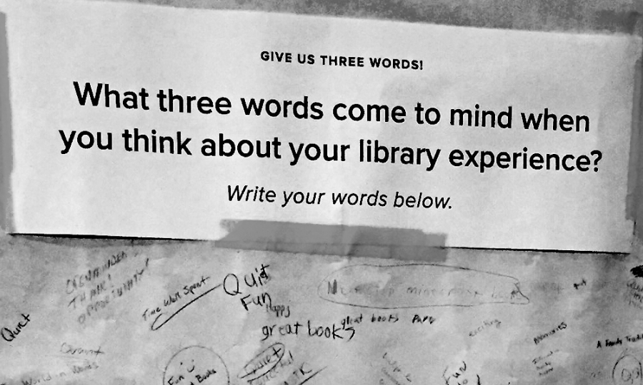
A design research method, graffiti walls have three parts:

  • a prompt (usually a single question),
  • a large-scale canvas (banner paper, chalkboard, bulletin board with notecards or sticky notes, etc.)
  • and writing materials (feel free to use color to encourage creativity!) for responses.

These materials are then placed in a common area where your audiences can interact with them. Graffiti walls gather qualitative data – i.e. words, shared language, creative responses that are descriptive in nature, and not numerical.

When Graffiti Walls Are Useful

Consider the audience you are trying to gather information from when deciding to use graffiti walls. Would your audience(s) be comfortable talking to a researcher? If not, a graffiti wall can provide an open forum for them to still be a valuable contributor.

Do time, space, or other constraints prevent easy access to your audience(s)? If so, graffiti walls can provide an accessible space to contribute over a sustained period of time.

Is language a key focus of your design research project (such as branding, organizational mission, vision, and values, etc.)? If so, graffiti walls can cast a wide net for gathering lots of language from a large group of contributors.

When…They Aren’t

Graffiti walls shouldn’t be considered the end-all, be-all method for collecting qualitative research from your audiences. If you’re trying to accomplish one of the below objectives, you should utilize a different design research method:

  • You need to hear from specific individuals. Graffiti walls are (typically) anonymous in nature, and don’t force participation. If you absolutely need to attribute input from a specific individual, a more focused, individual method should be used.
  • Your audience’s responses require context or expansion. Graffiti wall submissions are best as short, descriptive words and phrases. If your audience will want to explain their answer at length, consider interviews, surveys, or other methods that encourage expansive input.
  • You need quantitative data. If your research question needs to provide you with numbers, it’s best to stay away from graffiti walls – which, because of their open nature, should not be relied upon to score audience perception, satisfaction, or other metrics.

Reinventing Your Customer Experience

When it comes to the experiences your organization delivers, “good enough” is no longer an acceptable standard. Your customers – donors, members, patients, and even employees – are being actively courted by other organizations for their loyalty and support.

Customer experience (CX)—it’s a concept that’s having a moment in the spotlight. But what does it mean and what’s the best way to deliver it?

Put simply, CX encompasses all interactions with and aspects of a brand. Products, services (online or off) are all part of a cumulative customer experience. And by customers, we mean any audience that a brand serves: buyers, subscribers, students, donors, members, even employees. In today’s world, one experience that falls short can impact brand perception, so how can you ensure your CX is up to snuff?

Step one is to better understand the current experience.

The rest of this post will walk you through a few tools we often use in customer experience design. To bring these exercises to life, we’re going to use a mock example from an organization we’ve named FitCo. FitCo is a professional association for fitness trainers. They help members connect with one another, and provide access to new research, trends, tips and other professional development opportunities.

Step 1 – Identifying Your Customers

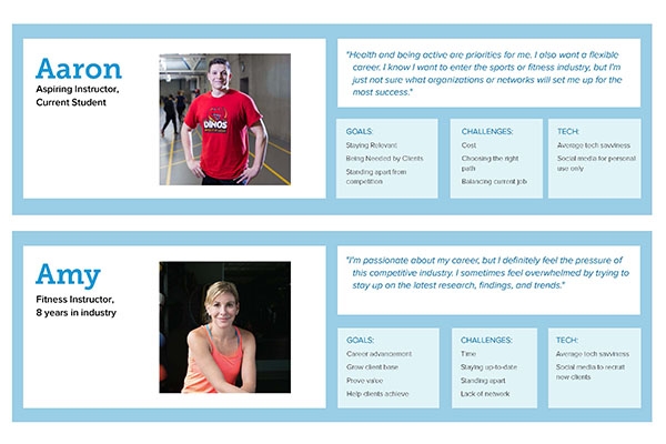
To begin, we must try to empathize with your audiences. Our first exercise focuses on building audience personas. A persona is essentially a profile of your average audience member. For CX purposes, you may even need to create multiple personas. Focus on their challenges, goals, feelings, thoughts, and actions. Sometimes demographics are useful but understanding the emotional attributes of your audiences is most critical.
Persona examples.
Download this persona example here.

Step 2 – Map Your Current Customer Journey

Journey mapping looks at your audiences’ experiences with your brand holistically. By mapping out the audiences’ journeys from beginning to end, you may find that there are some glaring pain points, or perhaps simple opportunities to create consistent and engaging interactions.

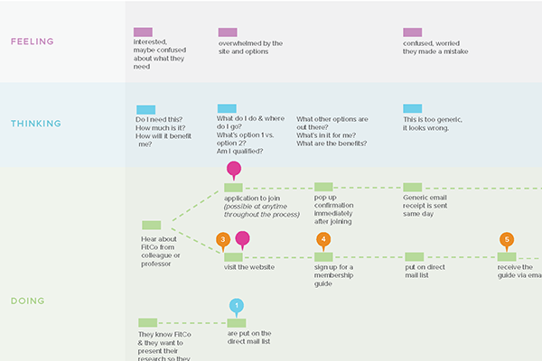
Journey map example.

Full journey map example here.

Your journey map may be more or less complicated than this example. You may decide that your team would benefit from a digitized version, or that butcher paper and sticky notes will suffice.

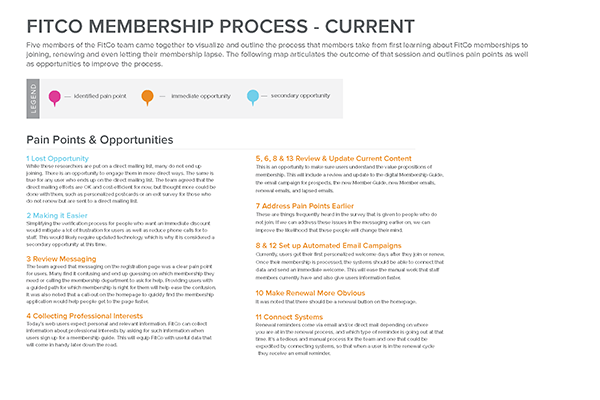
After completing the mapping activity, it’s critical to document and prioritize pain points and opportunities. Doing so at this juncture will make the next phase of work clearer.


Opportunities & paint points example here.

Step 3 – Create a Game Plan

Now it’s time to put your understanding of CX to the test by creating a game plan. Gather your collaborators and decision makers to set some actionable goals, to create a timeline and then dive in.

There are a few key tips to keep in mind:

KEEP LISTENING

Never stop empathizing! Contintue to gather qualitative and quantitative feedback from audiences as you tackle challenges and build solutions. Focus on the areas of improvement you have identified, but also listen for new opportunities. Here is one way to accomplish that:

  • Do some quick audience polling using your social media account.
  • Implement a HotJar survey on your website.
  • Ask respondents to polls and surveys if they’d be willing to do a follow-up phone interview.
  • Reach out personally to your audiences—involve your team members to reach out to your customers, donors, students, patients, or members.
COLLABORATE

Create a task force or committee and arm them with your customer experience research and creative problem-solving methodologies. Bonus points for using the design thinking framework to problem solve.

MEASURE

Define metrics as they relate to your overall goals. Consider these questions:

  • What’s your baseline?
  • What are you looking to increase or decrease?
  • How often will you measure?

It may feel overwhelming at first but clearly outlining and accomplishing these steps can get your team get started.

All of the exercises are also scalable based on time and resources available so give it a try to see what can work for you! At SmallBox, we urge both nonprofit organizations and businesses to utilize these tools to analyze and, ultimately, improve their customers’ experiences. By understanding your audiences and the interactions they share with your brand, you can design a distinctive experience that increases engagement and ensures retention.

Interested in learning more? Download the SmallBox Customer Experience Design Kit for a supplemental guide on the following exercises.

Data Untangled

Have you ever found yourself in the middle of a complex challenge, swimming in data or research, and you’re just not sure what to make of it? Conducting all of the research in the world is only as useful as our ability to make sense of it. With an emphasis on sense-making, the design thinking process includes an intentional approach on framing research and defining a path forward. In some ways, you can think of it like a string of lights…

Part I: The Scenario

It’s the first day of December. You and your family just got back from the tree farm where you spent hours dissecting every tree from every angle to find the perfect one for the living room. You just finished tightening the screws in the tree stand while your loved ones guided you with “Left! A little to the right! Perfect!” Music is playing, the family is laughing—everything is going smoothly, until…

It’s time for those damn Christmas tree lights.

You know what I’m talking about, right? Every year and without fail, holiday lights wind up in a tangled, disheveled mess. Untangling them has become an even bigger tradition than hanging up the mistletoe—kiss your blood pressure goodbye as you attempt to make sense of the shambled strands!

Even though we all know we’re going to go through the hassle of sorting the lights every winter, it’s still a daunting task. Everyone has that one box of lights stored in the attic filled with every kind of string imaginable: multicolor bulbs and classic white, indoor and outdoor, twinkling and continuous, working and not working (because of course you intend to find and replace that one bulb that burnt out three years ago). Without fail, the lights end up in a tangled mess. With so many bulbs at your disposal, where do you begin? It can be a real holiday headache.

Part II: The Metaphor

Believe it or not, a string of lights and design research have a lot in common.

When it comes to lights, everyone takes a different approach. Some of you may go straight for the ends while others begin sifting from the middle of the cluster. Some may plug the lights in to help guide them while others prefer to keep them off. Some of you may even throw the lights out and opt to get a new, nicely packaged set at the store.

Similarly, when it comes to data, there are many approaches on how to make sense of it. Some data may be sorted mathematically while other data makes more sense to sort artistically. Some data may be organized into a timeline while other data on a matrix. Regardless of the approach, the ultimate goal is to untangle the research data in a way that uncovers the brightest opportunities.

Part III: The Stuff that Matters

Let’s take a step back for a minute. You’ve done your research—conducted interviews, observed your audience interacting with your product, and looked at similar models for inspiration. All the while, you’ve been recording notes, drawings, photos, and transcripts. The vast amount of empathic data is intimidating, but it’s a good problem to have. You say to  yourself, “This stuff is awesome. But what do I do now?”

The next step in the design thinking process is to make sense of the data and uncover new opportunities. We call this phase the Frame Phase.

While it’s tempting to begin solving immediately after conducting research, synthesizing research data during the Frame Phase will uncover richer, more meaningful opportunities while also creating shared understanding on the opportunity-at-hand. It may feel impossible, sticky, or daunting at times, but don’t give up! Here are a few tips to get you started:

Step One: Make your data physical.

The first step in the framing process to to externalize all of your data. Get your research in a physical space so you can mold it, play with it, and organize it quickly. This could be on sticky notes, index cards, whiteboards or giant butcher paper. Getting data onto the wall also allows for collaborative sense-making to take place.

Step Two: Sort your data until it makes the most sense.

Data lends itself to different methods of sorting, and we all may sort the same data in a different way. The challenging part about the Frame Phase is that there are no right or wrong answers.

Time-based data lends itself toward journey mapping—charting audience’s activities across the course of an hour, day, or year. Journey maps can include not only the audience’s actions, but also their feelings, thoughts, and pain points. This type of sense-making puts your audience at the center of the story, allowing the team to solve for his or her most important needs.

Relational data lends itself toward affinity and/or venn diagramming—grouping data points as they relate to each other. Similar data points may be grouped together while contrasting ones be separated. This type of sense-making helps explain connections between your research.

Through sense-making, you’re looking to identify trends in your research and come up with insights.

Step Three: Record opportunities that you’ve found.

The last step in the Frame Phase is to make your insights actionable. We’ve found that turning insights (or problem areas) into questions allows us to connect our research to our ideas. “How might we…” statements serve as a launchpad for our ideas. For example, “How might we increase collaboration in our organization during the holiday season?” frames the problem (lack of collaboration) as an opportunity. These “How might we…” statements serve as generative questions for a team to brainstorm solutions, as well as test their solutions against.

Part IV: Tying It All Together

The Frame Phase has often been called the most challenging part of the design thinking process—and for good reason. Data gets messy, tangled, and confusing. However, when we embrace this feeling of overwhelm and prepare for it, we’re able to take the information in our hands and untangle it one strand at a time. It may take patience, a lot of practice, and an entire team, but at the end we find ourselves in the midst of glowing opportunities we can take into the next phases: ideation, prototyping, and testing

What will you find when you untangle the lights?

Why Empathy?

For many years, SmallBox has started our major projects with what we’ve called a “Discovery” phase. This is an essential first step because we’ve learned from experience that our ideas, designs, and project outcomes are all stronger when we go through an intentional research process. To do our best work, we need to empathize before solving.

What is Empathy?

em·pa·thy
     Noun
     the ability to understand and share the feelings of another.

Sometimes called design research, or an empathy phase in a human-centered design process, this focus is all about understanding the experience, perspective and emotions of your audiences, then applying what you’ve learned to your services or products.

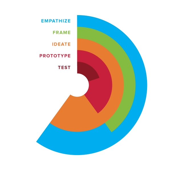
Here’s the design thinking process we use at SmallBox:

steps of the design thinking - empathize, frame, ideate, prototype and test

But in reality it looks more like this:

Nonlinear depiction of design thinking process

While the process is non-linear and can move back and forth from one phase to another, it always starts with empathy. And for good reason.

Why is empathy important?

Empathy leads to…

  • Greater understanding of the people you serve.
  • Dispelled assumptions and biases about how and why people interact with your service or product.
  • Creating more meaningful solutions that are more readily adopted.
  • Becoming more responsive to audience needs.
  • Operating your business in a human way.

Conducting design research to truly empathize with people may seem like it takes a lot of time, or slows down your process. It’s seductive to just jump in and start solving right away. However, the time spent up front can save a lot of time later. Without really understanding your audience needs, you could waste resources creating a new offering that doesn’t resonate or actually meet those needs.

Having your audiences take part in the process from start to finish fosters buy-in for both the cause and the solution. It allows for transparency that ultimately creates shared understanding and a wider variety of potential solutions.

Listening and observing can help you discover unmet needs and possibilities you never knew existed. You might miss a huge opportunity that someone else eventually spots and acts on.

How to get started

Here are some basic first steps to incorporating empathy into your work:

  • Identify groups of people who are critical to your success. This might be your team, your customers, or key partners. You may already have strong awareness of who your audiences are and know how to reach them – if so, you’ve got a head start!
  • Ask yourself what you don’t know know about the people you care about. Are you basing everything you know off of one thing one person said five years ago? Sometimes it is hard to be honest with ourselves. We have cognitive biases that help us confirm long held opinions. Step back, take a critical look at what you think you know about your audiences, and make note of any assumptions you are making.
  • You can start simply with listening. Interviewing is a foundational skill for empathy research. Use your assumptions list to create a bank of questions to prepare for interviewing your audiences. Make sure to approach these conversations with curiosity and a commitment to staying neutral (remember those cognitive biases we mentioned earlier?). What you can learn through a series of thoughtful, objective interviews can be eye opening.
  • Tap into the power of observation. If you have never watched people interact with your product or service, make a point to do so. Observation can paint a whole new picture – sometimes showing things we might never know to ask, or a person might not think to bring up in an interview.

While there are many advanced and creative empathy research methods – everything from contextual inquiry to diary studies – it’s okay to start with basics.

What does it look like?

illustration of ice cream scoops by sara mcguyer

In the book Creative Confidence, co-authors Tom and David Kelley mention a scenario of researching how to improve the ice cream scoop. Most people, when asked to talk through their process, shared the basics of how they used the scoop to get ice cream – get the scoop out of a drawer, warm it with water, start on one far side of the container and scoop toward the other, etc. But most people failed to mention that they licked the scoop before tossing it into the sink. It was either an unconscious thing, or they didn’t feel it was important enough to mention. By engaging in empathy research and observing people in action as they scooped ice cream, this detail emerged.

Having moving parts (as some scoops do) becomes a lot less desirable. Without empathy, they would have missed this detail all together, and maybe built the wrong kind of scoop. Getting to these details, as mentioned earlier, is why empathy is so important and useful.

The more I practice empathy research, the more I see it as a gift that keeps on giving. More depth in understanding about your audiences. Greater insights in how to serve them. A more informed, human-driven experience or product designed to elicit a positive response from the people who matter the most – your audiences, customers and employees!