Why Nonprofits Should Embrace Human-Centered Design

Let’s face it – when it comes to serving others, “optimization” and “automation” will only take you so far.

There are a thousand tools for increasing donations, sending pithy emails, and microtargeting followers and potential converts across social media and the web. But good tools will only take you so far – and to truly scale your organizational impact, you’ve got to go beyond big data and get off-screen (you can wait till you read the rest of this post…).

Think of human-centered design as a platform-agnostic toolkit that can help you scale your organizational impact. Whether you’re in the backyard or the board room, intentionally including the audiences you serve when developing program updates, service offerings, project roadmaps, or strategic plans, you’ll gain…

Throwing the Challenge Flag

Grocery stores are lined with pumpkins and Halloween endcaps. Coffee shops across the country have released autumnal treats. We’ve rolled right through false fall and into second summer. 

That can only mean one thing: football season has arrived. Aside from the usual fantasy football office chatter, a surprising discussion around user research, UX/UI design, and heuristics has been prompted by some…er…interesting design decisions from ESPN’s Monday Night Football graphics package. 

The first MNF game of the freshly minted NFL season featured a great matchup between the New Orleans Saints and the Houston Texans, and a new graphics package for the ubiquitous scorebug at the bottom of televised sports events. Spectators rely on this line to keep track of the game clock, score, penalties, and something called the down-and-distance marker that shows what down it is and the distance to go for a first down. If you’re not a football fan and all of this seems confusing, all you need to know is the down-and-distance marker graphic changes to alert viewers when a penalty flag has been thrown by the referee and that these penalty flags that often litter the field are bright yellow. With this knowledge, it would seem fairly obvious then that when considering the design of this down-and-distance marker, there would be one color you should steer clear of unless a penalty flag has been thrown. So what color did ESPN used for their standard down-and-distance graphic?

You guessed it — yellow. It was a bit of a baffling design decision, especially for a network that deals exclusively with sports broadcasting. Making it even more confusing, because they decided to use yellow as their color of choice for normal use, they opted to use a black background to indicate when a penalty flag was thrown. Of course, it took no time at all for the twitter universe to explode with comments of confusion, derision, and pleas for change. In defense of ESPN, they heard those pleas, acted fast and changed their graphics package to a more standard black and white down-and-distance marker by the start of the second half. It even prompted an acknowledgment and direct twitter response from an ESPN communications director.

For our team, this prompted some thoughts on a few different topics — the first being user research. Obviously, we weren’t privy to what sort of design thinking and user research went into the creation of this scorebug graphics package, but it’s hard to believe it was very extensive if public reaction is a reliable metric. Iteration is an important sub-step in the design thinking process, and certainly ESPN showed their willingness to adapt and iterate on the fly. Though it would have been preferable to do this in a user research and prototyping phase, the old adage “better late than never” generally rings true. In addition to user research, careful consideration of UX/UI design and heuristics would have likely helped to avoid this calamity (Okay, maybe not a calamity, but this is football and a little drama comes with the territory). A couple of the tenants of UX heuristics laid out by famed computer scientist and usability consultant Jakob Nielsen are as follows:

  • Match the system and the real world, and
  • Establish consistency and standards.

This graphics package did a poor job of matching the information presented by the color system in the scorebug and the real-world color system of the physical penalty flags, and at the same time created a divide in consistency and standards that have long been established in the football world. This just goes to show the importance and impact that user research, design thinking, and UX/UI heuristics considerations can have on all projects. It’s something we always have in mind as we work hand in hand with our partners to innovate towards new design solutions and opportunities.

Thankfully this debacle (again, drama) has been put behind us for now — at least until the next questionable sports graphic decision makes headlines. Hey, the NBA season is just around the corner! We’ll keep our eyes peeled.

Dear Loved One: It’s Time We Talk

Love Letter / Breakup Letter

With Valentine’s Day around the corner (yes, those candy hearts can already be found on local shelves), we thought we’d share one of our favorite tools with you — Love Letter / Breakup Letter. Whether you’re struggling with donations or visibility, this simple tool can help elevate your brand, and create experiences that resonate and drive action. Download the facilitator’s guide and template and learn how to better connect with those you serve!

Improv Your Way to New Ideas

I recently watched David Letterman’s ‘My Next Guest is’ interview with Tina Fey — while the entire episode is worthy of your time, the clip below is the inspiration for this post. In it, Tina explains that one of the key rules of improv is “yes, and…”. Someone starts the scene with an idea or scenario and the next person agrees to it, and then builds upon it.

“Yes, and…” is also something we practice in design thinking. It pushes us to expand ideas and add onto them instead of saying, “No,” or “How about this instead?” When we can get beyond our own ideas and truly listen to others, that’s when the possibilities for innovation become limitless.

Tina further explains her rules of improv in the book “Bossypants.” She explains, “Now, obviously in real life you’re not always going to agree with everything everyone says. But the Rule of Agreement reminds you to “respect what your partner has created” and to at least start from an open-minded place. Start with a YES and see where that takes you.”

Another rule she shares is that there are no mistakes – only opportunities.

“If I start a scene as what I think is very clearly a cop riding a bicycle, but you think I am a hamster in a hamster wheel, guess what? Now I’m a hamster in a hamster wheel. I’m not going to stop everything to explain that it was really supposed to be a bike. Who knows? Maybe I’ll end up being a police hamster who’s been put on ‘hamster wheel’ duty because I’m ‘too much of a loose cannon’ in the field. In improv there are no mistakes, only beautiful happy accidents. And many of the world’s greatest discoveries have been by accident. I mean, look at the Reese’s Peanut Butter Cup, or Botox.”

This is similar to one of our rules for ideation – there are no bad ideas. Keeping an open mind and deferring judgment allow us to explore avenues and take risks with our ideas.

So what could an improv-based exercise look like? Here’s how it might work:

Activity: Improv Your Way to New Ideas

Goal: Prototype

Time Frame: 2-5 minutes per idea explored

People: at least two people; a third person to document could be helpful

Materials Needed: video for recording (bonus)

Difficulty Level: Medium (role-playing might be better suited for certain personalities)

Step One: Choose the idea to prototype.

Step Two: The first person creates a scenario related to the idea. For example, if the idea is to build a mobile health clinic, the person might set up the scene to signify they’re taking their daughter to the clinic.

Step Three: Whatever the first person says, no matter how whacky, the second must agree to by following lead and then introducing a new element to the scene. Perhaps they’re a doctor onsite, or they bring life to the mobile clinic and assume a characterized version of it.

Step Four: The first person then responds, and continues to build the scene. With each element that’s added, new details about the mobile clinic will emerge, making room for collaborative iteration. Piecing the puzzle together, you should end up with detailed description of how your mobile health clinic will function, what it looks like, how visitors engage with it, and so on and so forth.

Stay tuned to hear how this exercise works for us, or drop us a note if you decide to try it yourself. Let’s be honest though, anything inspired by Liz Lemon has to be great, right?


Innovation Starts with Hello.

A common myth on the topic of innovation is that there’s just no time for it. It’s hard to get a group of people in a room, with clear minds, to really focus and come up with the next idea. Other deadlines wait, schedules are packed, and we’re all just too busy to get to that visionary state of mind.

While all of that may actually be true – the real problem lies in the notion that innovation will happen from the inside out. Sure there are internal drivers that can help you achieve innovation – curiosity, a fail-first mentality, perhaps even obsession. But even with these things in place, the best ideas aren’t created when groups of people sit around and think. The best ideas come from actively engaging with and talking to those you serve. Innovation starts with Hello.

Starting conversations and working directly with your audiences is how you will uncover new insights. Until you truly know the way your audience interacts with your product or service, and perhaps more importantly, the motivations behind those interactions, it’s nearly impossible for you to continuously grow and improve.

This is why we practice human-centered design at SmallBox. With a commitment to design research – a type of research rooted in empathizing with real people and understanding their unique environments and contexts – we are constantly striving to keep the end-user at the core of all solutions and ideas. We co-design alongside them, test and iterate directly with them, and ultimately work to ensure the final outcome is truly something that will serve them.

When was the last time you spoke directly to a customer?

Here are three methods we commonly use to spark conversations, ideas, and opportunities:

  • Interviews: while one of the more common methods used for audience research, an interview can make or break your research based on your preparation and approach. Check out our how-to for conducting a successful interview.
  • Diary Study: this design research method allows you to collect input from audiences over a set period of time. It’s particularly useful if you’re working in a sensitive problem space or are logistically unable to speak directly to your audiences. Create a series of workbook pages, filled with questions, prompts, and space for the unknown.
  • Observation: Whether your offering is a service or a product, observing the way your audiences engage or interact with it can generate insights and additional questions you didn’t even know to ask. Be sure to conduct the study in user’s natural environment, and follow the A-E-I-O-U framework for documentation.

Once you have selected your research method(s), take a look at our suggested mindsets to help ensure a successful conversation!

Improve Board Orientation by Applying Design Thinking

Since SmallBox has been introducing nonprofits to a creative problem-solving methodology called Design Thinking, we often find that people think the creative framework is intimidating. But as we work with people and they learn about the Design Thinking process, they want to apply it to all their problems.

We are here to tell you it’s okay to be intimidated, and it’s okay to be excited. What you need to know is that Design Thinking shouldn’t be studied and put on the shelf, it requires that you take action and apply it. Even if it’s using one simple tool that you think can get to better insights for your team or outcomes for those you serve. We say commit to Design Doing (not just thinking)!

Let’s put the theory into practice and show you how you can apply a design thinking method to an ongoing nonprofit challenge: new board member on-boarding [aka orientation].

Tool: Journey mapping

In this exercise, the bigger your map, the better. Map the current new board member on-boarding process in a linear fashion on a big piece of butcher paper or a large white board. Flatten the process by mapping it in an order that makes sense, chronological typically works well. This means you need to create a beginning and an end of the on-boarding process.

As you are gathering insights about the current process in this exercise, it’s worth including as many informed stakeholders as possible. This may include new and former board members, staff, and anyone who has prepped, planned or experienced the current on-boarding process. What’s key to remember is that you are working to improve the process for the new board member, not for your nonprofit. Always keep the board member’s experience as the focus of your work.

Use colored Post-It notes to capture steps of the process and apply to the journey map. Post-Its create a visual aspect to the work that accesses the right brain, and allows you to change or add elements to the order of the process when needed. When completed you will have a visual diagram of all the touch points your new board members have during on-boarding.

Once you have mapped the current process, determine which parts of it delight new board members and which parts need improvement or confuse new board members. Ideally, you will ask board members who went through the process what their experience was. Where did they experience high points and low points? Highs and lows in the journey map can be identified using plus and minus symbols or any other creative way your team comes up with.

Once you have assembled all of your touch points and on-boarding highs and lows, you can start to assemble a list of what to capitalize on and what to improve.

Tool: oil change

This tool can be used in various settings, and we suggest applying it to the items on your journey map. This is a simple and quick tool aimed at creating efficient and participatory conversations about what people see in the journey map. It involves a group leader or facilitator asking a series of questions. Here are the ones we like to use:

  • Based on what you see on the journey map, what’s working?
  • Based on what you see on the journey map, what’s not working?
  • What’s missing from our board on-boarding journey?
  • What else?

The last two are purposely open-ended to encourage team members to bring new ideas forward to the group. We find that often when people start looking at on-boarding (or any journey) differently, it ignites creative ideas that deserve to be captured.

Once you have these questions answered, you can choose any number of voting methods to prioritize your areas of action and focus.

As Design Thinking gains more attention, we will continue to share our process so you can apply it with to the work you lead.


This article originally published on September 12, 2017, Charitable Advisors weekly newsletter.

Jenny Banner has been practicing amateur psychology since middle school. This interest in what makes people tick, led Jenny to careers sales, HR, and consulting as well as a graduate education in I/O Psychology (the psychology of the workplace). In her 15+ years of HR and consulting experience, Banner has worked with companies from Fortune 500 to start-ups, and observed similarities. As a consultant and coach her focus has been on leadership development, career transition, and training. She joined Smallbox as director of strategic initiatives and is applying her unique skill set to help organizations align their internal and external brand perceptions, and is working to refine educational offerings around problem solving using Design Thinking.

A Wall You’re Allowed To Write On

Entering a design research project can be intimidating – heck, sometimes it’s even tough to talk to a new coworker, not to mention interviewing and gathering data from hundreds, even thousands, of new faces. Graffiti walls can be a simple, open way of gathering input from diverse audiences – and are efficient. Once you’ve set up your graffiti wall, it’s not time-intensive to monitor or collect responses.

What Are Graffiti Walls?

A design research method, graffiti walls have three parts:

  • a prompt (usually a single question),
  • a large-scale canvas (banner paper, chalkboard, bulletin board with notecards or sticky notes, etc.)
  • and writing materials (feel free to use color to encourage creativity!) for responses.

These materials are then placed in a common area where your audiences can interact with them. Graffiti walls gather qualitative data – i.e. words, shared language, creative responses that are descriptive in nature, and not numerical.

When Graffiti Walls Are Useful

Consider the audience you are trying to gather information from when deciding to use graffiti walls. Would your audience(s) be comfortable talking to a researcher? If not, a graffiti wall can provide an open forum for them to still be a valuable contributor.

Do time, space, or other constraints prevent easy access to your audience(s)? If so, graffiti walls can provide an accessible space to contribute over a sustained period of time.

Is language a key focus of your design research project (such as branding, organizational mission, vision, and values, etc.)? If so, graffiti walls can cast a wide net for gathering lots of language from a large group of contributors.

When…They Aren’t

Graffiti walls shouldn’t be considered the end-all, be-all method for collecting qualitative research from your audiences. If you’re trying to accomplish one of the below objectives, you should utilize a different design research method:

  • You need to hear from specific individuals. Graffiti walls are (typically) anonymous in nature, and don’t force participation. If you absolutely need to attribute input from a specific individual, a more focused, individual method should be used.
  • Your audience’s responses require context or expansion. Graffiti wall submissions are best as short, descriptive words and phrases. If your audience will want to explain their answer at length, consider interviews, surveys, or other methods that encourage expansive input.
  • You need quantitative data. If your research question needs to provide you with numbers, it’s best to stay away from graffiti walls – which, because of their open nature, should not be relied upon to score audience perception, satisfaction, or other metrics.

Reinventing Your Customer Experience

When it comes to the experiences your organization delivers, “good enough” is no longer an acceptable standard. Your customers – donors, members, patients, and even employees – are being actively courted by other organizations for their loyalty and support.

Customer experience (CX)—it’s a concept that’s having a moment in the spotlight. But what does it mean and what’s the best way to deliver it?

Put simply, CX encompasses all interactions with and aspects of a brand. Products, services (online or off) are all part of a cumulative customer experience. And by customers, we mean any audience that a brand serves: buyers, subscribers, students, donors, members, even employees. In today’s world, one experience that falls short can impact brand perception, so how can you ensure your CX is up to snuff?

Step one is to better understand the current experience.

The rest of this post will walk you through a few tools we often use in customer experience design. To bring these exercises to life, we’re going to use a mock example from an organization we’ve named FitCo. FitCo is a professional association for fitness trainers. They help members connect with one another, and provide access to new research, trends, tips and other professional development opportunities.

Step 1 – Identifying Your Customers

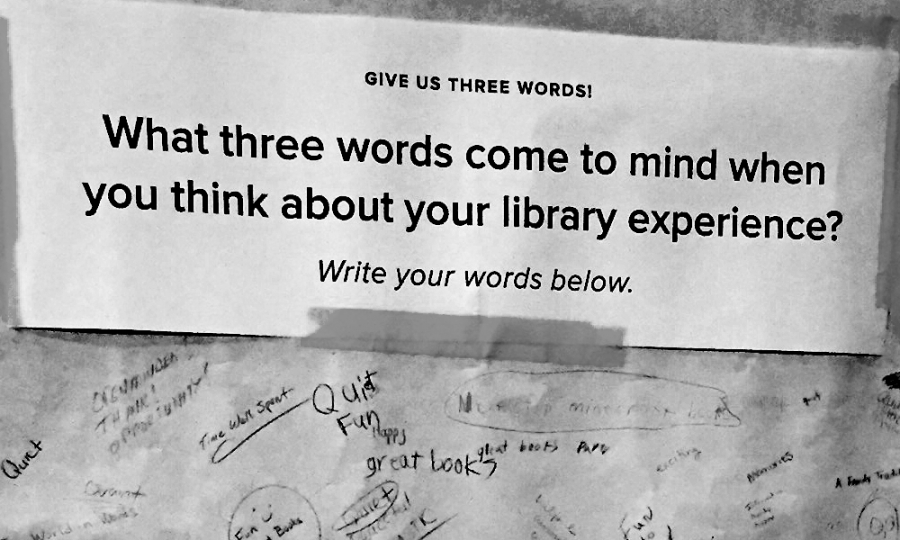
To begin, we must try to empathize with your audiences. Our first exercise focuses on building audience personas. A persona is essentially a profile of your average audience member. For CX purposes, you may even need to create multiple personas. Focus on their challenges, goals, feelings, thoughts, and actions. Sometimes demographics are useful but understanding the emotional attributes of your audiences is most critical.
Persona examples.
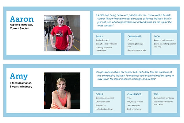
Download this persona example here.

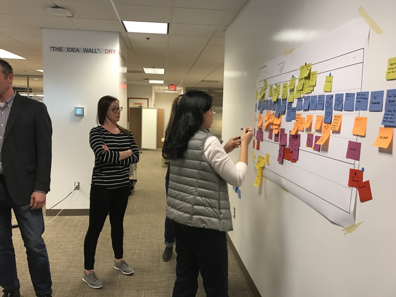
Step 2 – Map Your Current Customer Journey

Journey mapping looks at your audiences’ experiences with your brand holistically. By mapping out the audiences’ journeys from beginning to end, you may find that there are some glaring pain points, or perhaps simple opportunities to create consistent and engaging interactions.

Journey map example.

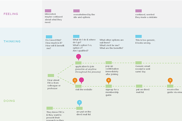
Full journey map example here.

Your journey map may be more or less complicated than this example. You may decide that your team would benefit from a digitized version, or that butcher paper and sticky notes will suffice.

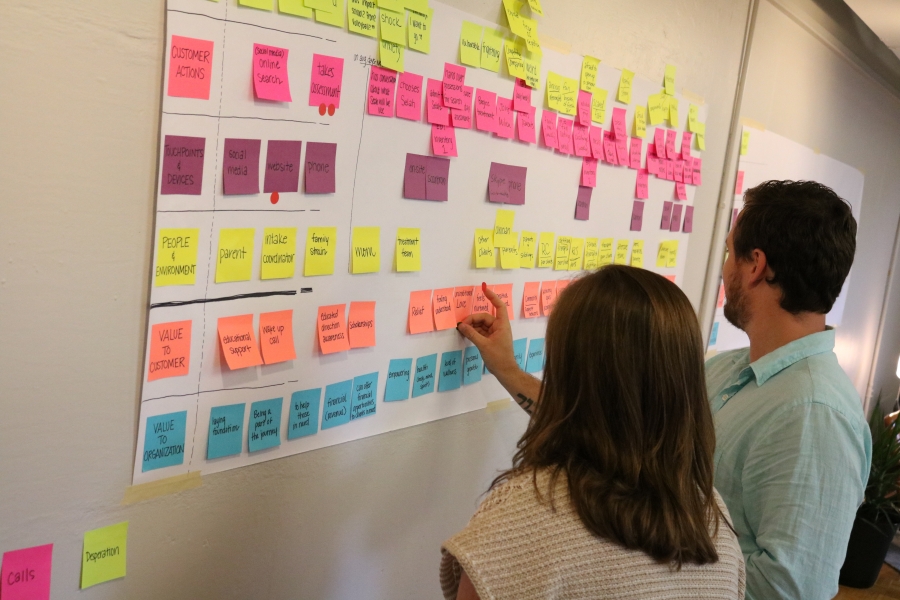
After completing the mapping activity, it’s critical to document and prioritize pain points and opportunities. Doing so at this juncture will make the next phase of work clearer.


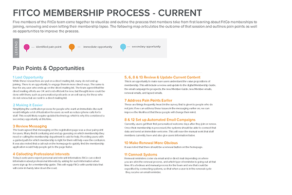
Opportunities & paint points example here.

Step 3 – Create a Game Plan

Now it’s time to put your understanding of CX to the test by creating a game plan. Gather your collaborators and decision makers to set some actionable goals, to create a timeline and then dive in.

There are a few key tips to keep in mind:

KEEP LISTENING

Never stop empathizing! Contintue to gather qualitative and quantitative feedback from audiences as you tackle challenges and build solutions. Focus on the areas of improvement you have identified, but also listen for new opportunities. Here is one way to accomplish that:

  • Do some quick audience polling using your social media account.
  • Implement a HotJar survey on your website.
  • Ask respondents to polls and surveys if they’d be willing to do a follow-up phone interview.
  • Reach out personally to your audiences—involve your team members to reach out to your customers, donors, students, patients, or members.
COLLABORATE

Create a task force or committee and arm them with your customer experience research and creative problem-solving methodologies. Bonus points for using the design thinking framework to problem solve.

MEASURE

Define metrics as they relate to your overall goals. Consider these questions:

  • What’s your baseline?
  • What are you looking to increase or decrease?
  • How often will you measure?

It may feel overwhelming at first but clearly outlining and accomplishing these steps can get your team get started.

All of the exercises are also scalable based on time and resources available so give it a try to see what can work for you! At SmallBox, we urge both nonprofit organizations and businesses to utilize these tools to analyze and, ultimately, improve their customers’ experiences. By understanding your audiences and the interactions they share with your brand, you can design a distinctive experience that increases engagement and ensures retention.

Interested in learning more? Download the SmallBox Customer Experience Design Kit for a supplemental guide on the following exercises.

How Do I Know Which Design Thinking Method To Use?

Over the past year, we have hosted several workshops for businesses and organizations throughout the Midwest who see the potential in implementing a human-centered design approach into their work and culture. People often appreciate the process, but have a hard time understanding how to incorporate it into their daily tasks once they leave. Participants often ask, “Is there a guide that will tell me when to use each of the methods?

The answer is, not really.

The good news? There are many research options to get started and working examples of how different methods have yielded data towards solving specific problem spaces, but ultimately, there’s no prescriptive guide for when to use methods. This might sound like a cop-out but the reasoning lies at the core of human-centered design––it all comes back to your unique audience needs.

There are standard methods to choose from like interviews, surveys, mapping, observations and card sorting, but we encourage people to embrace the methodology. Don’t feel constrained by the methods you know––iterate, customize, gamify––whatever you need to do to relate to your audience and give and receive valuable input. Know that you may need to adjust and adapt on the fly, that’s okay! That’s part of the process. Try not to get caught up in forcing a method if it is not working. If interviews or surveys are not producing the data you need, reassess. Find out what’s missing and what you need to move forward. You may include analogous observations or immersing yourself in a particular environment to get more helpful information.


Part of the design process is coming up with a method that will best relate to your audience in a way that will get you the information you need. For example, if you need to customize messages to specific audiences, you may want to interview folks and build out personas. While this means methods are customized for every problem space, there are some common things to think about:

  • What is it that you want to learn?
  • How many different audience types will you need to interact with?
  • How does your audience best communicate?
  • Are you able to have direct communication with them or do you need to explore appropriate indirect methods?
  • How can you relate the experience to something familiar and comfortable for them?
  • What are the limitations of the intended method?
  • How much time or budget is available?

The most important thing to remember is to empathize with the people whose problem you’re striving to solve. Explore different methods, practice them with friends or co-workers to build out techniques and applications, and adapt them to work for you.

How to Ideate: Think About Bad Ideas First

Have you ever pulled your team together for an ideation session that just didn’t go the way you expected? You presented a problem to solve, asked for ideas and the cold, blank stares left you feeling chilled to your bones.

Or maybe you’ve attended a session like this and without preparation, a 900-pound-guerilla-of-a-question is thrown your way so you sheepishly hand it a banana in hopes that it doesn’t eat you.

Whether participating or facilitating, we’ve all been there. When you want to get the most out of your teams’ creative energies, there are endless tips and tricks on how to prepare your team for the session, how to keep the energy alive, how to keep everyone on track, etc.

Today, I thought I’d share a tip on how to warm up your time – the trick to getting to the good ideas is to actually start with the bad ideas.

One way to do this is a quick exercise designed to ease nerves, and help people tap into their creative sides with quick doodles.

  • Give each participant a stack of blank index cards (roughly 10) and a sharpie marker.
  • Write a question/prompt on a board nearby.
  • Give the participants 5 minutes to draw as many bad ideas as they can (bonus points for some background music!).
  • Once the time is up, have participants share their favorite bad ideas.
  • You’ll have the room laughing and the tensions eased.

To take this exercise a step further, you could add a second round and ask participants to go back through their bad ideas and flip them into something that could work. This will help show that there is a fine line between the “bad” and “good” and that all ideas are useful in some way.

A third iteration is to have participants start with a stack of fresh cards and go for the wildest idea, pushing them to think outside of the box, no limitations – the crazier the better.

Once you get to the real ideation exercise, you can apply the ‘bad ideas’ approach again by getting out all of the obvious, already-stated ideas that everyone is already thinking about. We often put pressure on ourselves to come up with something new and inventive, but until we let go of what’s already there, there isn’t room to explore the not-so-obvious. To that end, encourage participants (or yourself!) to get those ideas out, even if you know they aren’t the greatest. Don’t wait until the perfect one hits, just write them all down and you’ll certainly get closer to the next big thing a bit sooner.

ideaton-sketching

During an ideation session with ACSM, we asked the group to give us their best ‘bad ideas’ on how to improve communication with their members. One suggestion, shown here, was to use a  telephone tree to release all news and information amazing!