Three Reasons Why Your Neighborhood Needs a Brand

When’s the last time you thought about the story of your neighborhood? Who are your neighbors? What serves as the cornerstone of your block? How do people celebrate? Why do people choose to live here in the first place?

All of these questions (and more) can be used to inform a neighborhood’s message. And while a visual identity is important, a neighborhood brand is more than just a logo on a light post banner. Here are three reasons why a neighborhood brand matters.

1. To build a sense of place for your current residents.

Your current residents have invested in your neighborhood, and they have many stories to tell. What if their stories—the things they love and admire about their neighborhood—were woven into the brand you create? By listening to your residents and incorporating their voices in the branding process, you can create a unified neighborhood story that sparks pride. In doing so, you create a sense of place for your current residents, providing both an identity and message that they can relate to.

2. To convey professionalism when seeking resources.

How many times have you sought out funding, only to find yourself wishing you had a brand to make your request seem more official? Creating a neighborhood brand conveys a sense of professionalism when seeking resources, especially when you’re applying for grants of buying land. Simply having a visual identity at the bottom of your page (or perhaps even a website to send someone to) can strengthen your application.

3. To attract new residents who connect with your neighborhood’s story.

While brands can strengthen the social fabric of our neighborhoods as they exist now, they can also serve to attract new residents. Creating a brand can (and should) be a strategic, market-driven decision. Your brand should position your neighborhood as unique, highlighting what makes it different than those around it. That being said, creating an authentic brand will bring in new residents who truly connect with your neighborhood’s story. At the end of the day, isn’t that what we all want? Committed individuals who are willing to invest in their homes and their neighbors.

The next time you spot a neighborhood logo, take a moment to think about what the story of its residents might be. To them, it’s so much more than just the brand—it’s an extension of their own identity.

How to Design an Inspiring Annual Report

Designing an annual report is no small feat. Every year, foundations and nonprofits go through the same process of identifying stories, writing content, designing, and printing. This process can often feel laborious and repetitive, however, it doesn’t have to. Consider these six tips to design an engaging annual report — one that celebrates the work done and inspires action for the work ahead:

1. Choose a format that your audiences actually use.

Always strive to meet your audiences where they are. Do they read print? Are they online? Do they gather in-person? Understanding how your audiences choose to share and consume information will inform the format or platform you choose, making your report more accessible.

Photo credit Sharon Matthew.

2. Craft a compelling narrative.

This requires you to take a step back and ask ‘what is the purpose of the modern annual report?’ For some organizations, your report might serve as an artifact—something you create for historical documentation. For others, it might be about sharing the the origin story of your work, illustrating the connection between where you’ve been the past year and where your focus is moving forward. Honing in on its purpose will allow you to keep the message clear and the readers engaged.

Photo Credit Gian Jurado.

3. Visualize the story through photos and numbers.

People consume information in many different ways. Some prefer long-form content, while others prefer visual forms of storytelling. Using compelling photos and highlighting impressive numbers adds diversity to your annual report, creating interest and providing an easier entry point for your audiences.

Photo credit Hung Ngo.

4. Create interest through hierarchy and whitespace.

Similar to photos and numbers, typographic hierarchy and whitespace can also add interest to your annual report. By using bold type, you can quickly communicate powerful messages, emphasize important passages, and draw your readers’ eyes down the page. By using ample white space, you can affect the pacing of your annual report (and therefore, the speed at which your readers move through the content).

Photo credit Belu.

5. Serve “bite-size” stories.

People are inundated with information. By reformatting your annual report into smaller, more bite-sized stories, the chances of the information “sticking” is much higher. People are more likely to remember elements of your annual report if they’re presented in a digestible way.

Photo credit KRISHNAPRIYA (KP) DUTTA GUPTA.

6. Draw audiences in with suspense.

Not surprisingly, the first thing your readers see will set the tone for your entire annual report. When choosing a photograph, headline or graphic to use on your cover (or digital hub, depending on your format), consider what will draw your readers in. Thought-provoking visuals and statements will create a sense of suspense, encouraging readers to dive in.

With a little pre-planning and some imagination, every organization can design an inspiring annual report.

Are you struggling to infuse creativity in your annual report process? Drop us a line.

The Highlights Reel

A Few Favorites from 2018

As we gear up for an exciting year ahead — we also want to say THANK YOU to all of those who trusted us, partnered with us, or simply followed along and cheered for us in 2018. Take a peek at some of our favorite designs from last year.

Going from “Should” to “Could”

A Shift in Mindset

From a young age, we are taught that it is best to have answers to all of life’s problems.

We are exposed to all kinds of formulas, theories, and processes that provide step-by-step guides for solving head-scratching hurdles. When we enter employment, we take that knowledge with us and are then trained on assembly lines, workflows, spreadsheets, and more. We are conditioned to believe there is a right way and wrong way to do our work. We are taught and trained on what we should do. After all, who doesn’t want to have all of the answers (or at least know how to get them)?

So what happens when the problem is messy? When it involves people’s lives, emotions, and everyday living? All too often, we are asked—what should I do?

Instead of thinking about what you should do, consider what you could do.

Many problems that exist today are not solvable through formulas and theories. When these challenges seem overwhelming, we are often paralyzed by the idea that we have to know the exact answer or next step to make a difference. Rather than approaching it with such rigidity, perhaps the best way to tackle the challenge is be asking “What could I do?” Approacht the problem from an “ideas” perspective, staying open and generative. As long as your ideas are rooted in compassion and empathy, try them out. By shifting your mindset from should to could, you’ll relieve the pressure that goes along with having to know all of the answers, and will instead feel free to explore new ideas and learn along the way.

Food for Thought

The belief that we should do something bleeds into our personal lives as well. How many times have you said something like “I really should fix the fence this weekend,” or applied the word “should” to trying a new hobby? Using the word “should” in our personal lives can sometimes create a sense of obligation and guilt. Next time you’re planning your weekend, I challenge you to think not about what you should do, but rather, what you could do.

Data Untangled

Have you ever found yourself in the middle of a complex challenge, swimming in data or research, and you’re just not sure what to make of it? Conducting all of the research in the world is only as useful as our ability to make sense of it. With an emphasis on sense-making, the design thinking process includes an intentional approach on framing research and defining a path forward. In some ways, you can think of it like a string of lights…

Part I: The Scenario

It’s the first day of December. You and your family just got back from the tree farm where you spent hours dissecting every tree from every angle to find the perfect one for the living room. You just finished tightening the screws in the tree stand while your loved ones guided you with “Left! A little to the right! Perfect!” Music is playing, the family is laughing—everything is going smoothly, until…

It’s time for those damn Christmas tree lights.

You know what I’m talking about, right? Every year and without fail, holiday lights wind up in a tangled, disheveled mess. Untangling them has become an even bigger tradition than hanging up the mistletoe—kiss your blood pressure goodbye as you attempt to make sense of the shambled strands!

Even though we all know we’re going to go through the hassle of sorting the lights every winter, it’s still a daunting task. Everyone has that one box of lights stored in the attic filled with every kind of string imaginable: multicolor bulbs and classic white, indoor and outdoor, twinkling and continuous, working and not working (because of course you intend to find and replace that one bulb that burnt out three years ago). Without fail, the lights end up in a tangled mess. With so many bulbs at your disposal, where do you begin? It can be a real holiday headache.

Part II: The Metaphor

Believe it or not, a string of lights and design research have a lot in common.

When it comes to lights, everyone takes a different approach. Some of you may go straight for the ends while others begin sifting from the middle of the cluster. Some may plug the lights in to help guide them while others prefer to keep them off. Some of you may even throw the lights out and opt to get a new, nicely packaged set at the store.

Similarly, when it comes to data, there are many approaches on how to make sense of it. Some data may be sorted mathematically while other data makes more sense to sort artistically. Some data may be organized into a timeline while other data on a matrix. Regardless of the approach, the ultimate goal is to untangle the research data in a way that uncovers the brightest opportunities.

Part III: The Stuff that Matters

Let’s take a step back for a minute. You’ve done your research—conducted interviews, observed your audience interacting with your product, and looked at similar models for inspiration. All the while, you’ve been recording notes, drawings, photos, and transcripts. The vast amount of empathic data is intimidating, but it’s a good problem to have. You say to  yourself, “This stuff is awesome. But what do I do now?”

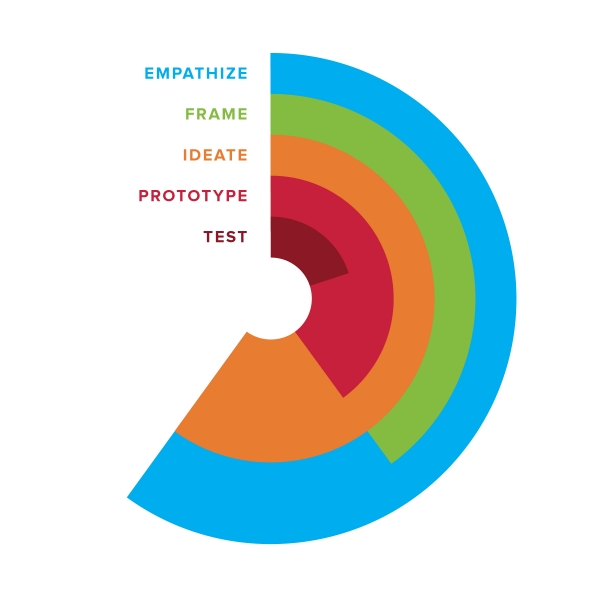
The next step in the design thinking process is to make sense of the data and uncover new opportunities. We call this phase the Frame Phase.

While it’s tempting to begin solving immediately after conducting research, synthesizing research data during the Frame Phase will uncover richer, more meaningful opportunities while also creating shared understanding on the opportunity-at-hand. It may feel impossible, sticky, or daunting at times, but don’t give up! Here are a few tips to get you started:

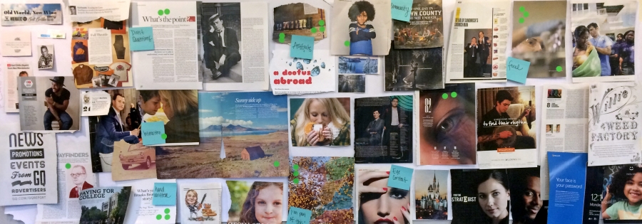
Step One: Make your data physical.

The first step in the framing process to to externalize all of your data. Get your research in a physical space so you can mold it, play with it, and organize it quickly. This could be on sticky notes, index cards, whiteboards or giant butcher paper. Getting data onto the wall also allows for collaborative sense-making to take place.

Step Two: Sort your data until it makes the most sense.

Data lends itself to different methods of sorting, and we all may sort the same data in a different way. The challenging part about the Frame Phase is that there are no right or wrong answers.

Time-based data lends itself toward journey mapping—charting audience’s activities across the course of an hour, day, or year. Journey maps can include not only the audience’s actions, but also their feelings, thoughts, and pain points. This type of sense-making puts your audience at the center of the story, allowing the team to solve for his or her most important needs.

Relational data lends itself toward affinity and/or venn diagramming—grouping data points as they relate to each other. Similar data points may be grouped together while contrasting ones be separated. This type of sense-making helps explain connections between your research.

Through sense-making, you’re looking to identify trends in your research and come up with insights.

Step Three: Record opportunities that you’ve found.

The last step in the Frame Phase is to make your insights actionable. We’ve found that turning insights (or problem areas) into questions allows us to connect our research to our ideas. “How might we…” statements serve as a launchpad for our ideas. For example, “How might we increase collaboration in our organization during the holiday season?” frames the problem (lack of collaboration) as an opportunity. These “How might we…” statements serve as generative questions for a team to brainstorm solutions, as well as test their solutions against.

Part IV: Tying It All Together

The Frame Phase has often been called the most challenging part of the design thinking process—and for good reason. Data gets messy, tangled, and confusing. However, when we embrace this feeling of overwhelm and prepare for it, we’re able to take the information in our hands and untangle it one strand at a time. It may take patience, a lot of practice, and an entire team, but at the end we find ourselves in the midst of glowing opportunities we can take into the next phases: ideation, prototyping, and testing

What will you find when you untangle the lights?

Getting Moody

Sometimes it’s tough to know where to begin when designing a website. When given the chance to create something completely new (or ‘refresh’ the look and feel of a site), it can seem like a daunting task. The opportunities are endless—from sorting through Pantone swatches in search of the perfect shade of red to sifting through hundreds of typefaces in pursuit of the most appropriate lowercase letter ‘g’. There’s so much potential in a blank Photoshop file. It’s exciting and overwhelming at the time.

This creative predicament doesn’t just apply to websites; it may apply to brands, print materials, wedding planning, parties, and even remodeling bathrooms. With so many choices, where does one begin?

Two words, folks (or one word, depending on who you ask): mood boards.

What is a mood board?

Mood boards are used in a variety of disciplines to evoke the overall design direction and tone of a project. Mood boards aren’t actually ‘boards’ per se, but rather a compilation of the various elements that may contribute to a project. For example, a website mood board may include color swatches, typefaces, photographs, illustrations, icons, and patterns that will inspire a new site.

Mood boards are used to provide creative direction to a project—they’re broad on purpose. They serve as a palette for designers to pull, mix, and mold the pieces together as she begins to apply the element tones to the actual project.

Why should I use a mood board?

Mood boards are extremely useful as a team tool, allowing all members to contribute to the compilation and discuss its specific elements using a common language. For example, when brainstorming photography for a new site, one person’s definition of ‘clean’ might be vastly different from another person’s definition of ‘clean’. Discussions around the tone of specific elements in a mood board help designers determine what exactly is most appropriate for a project.

Exploring mood boards as a team also creates a safe space to explore. Ultimately, there are no surprises. Rather, all participants get to have a part in shaping the visual direction of a project. Everyone is invested.

How do I create a mood board?

Mood boarding comes in many formats. To begin any mood boarding exercise, however, it is important to consider the words and questions involved in articulating the tone of the new project. What values do we want to exhibit? How do we want people to feel when they see this work? How do we move them?

After some discussion and reflection, it is important to then collect as many elements as possible that are thought to evoke the desired tone. Diverge before converging. Explore a variety of compilations before deciding on one direction. Once this direction is found, it is then important to document it clearly.

Analog documentation may involve the collection of specific elements torn from magazines pages and other print pieces. Elements such as photographs and typefaces may be placed alongside color swatches and textures and tacked on an actual board. Digital mood boards may be a curation of images found across the web and placed within a flat, printed document.

Once things are documented and approved, it’s time to move into design!

To sum things up, mood boards are a wonderful tool for providing the creative direction of a project by compiling the specific elements that make up its palette. And furthermore, mood boards come in many formats—from collages, to gridded .PSD files, to Pinterest boards.

Yes, that’s right: Pinterest boards.

What have your experiences been with mood boarding? Have you done it before without even realizing (say, when pinning ideas on your bathroom remodel)?